athenainsight.com
website design
athenahealth has a cloud-based electronic health record platform, which means they are constantly collecting a tremendous amount of data. And from all that big data, they have unique insight into many of healthcare’s hottest topics; from doctor burnout to the resurgence of Lime Disease.
They wanted a content hub where they could share interesting articles, infographics and cutting edge interactive tools, to prove their commitment to “unbreaking healthcare” and demonstrate their leadership in the healthcare technology space. No biggie.
We started with an extensive content audit and UX phase, where we dug into all of their pieces and understood how best to organize them. We needed a look and feel that could live as a flexible design system, so it couldn’t be precious or nuanced. It needed to be clean, and contemporary, while at the same time staying connected to their existing brand.
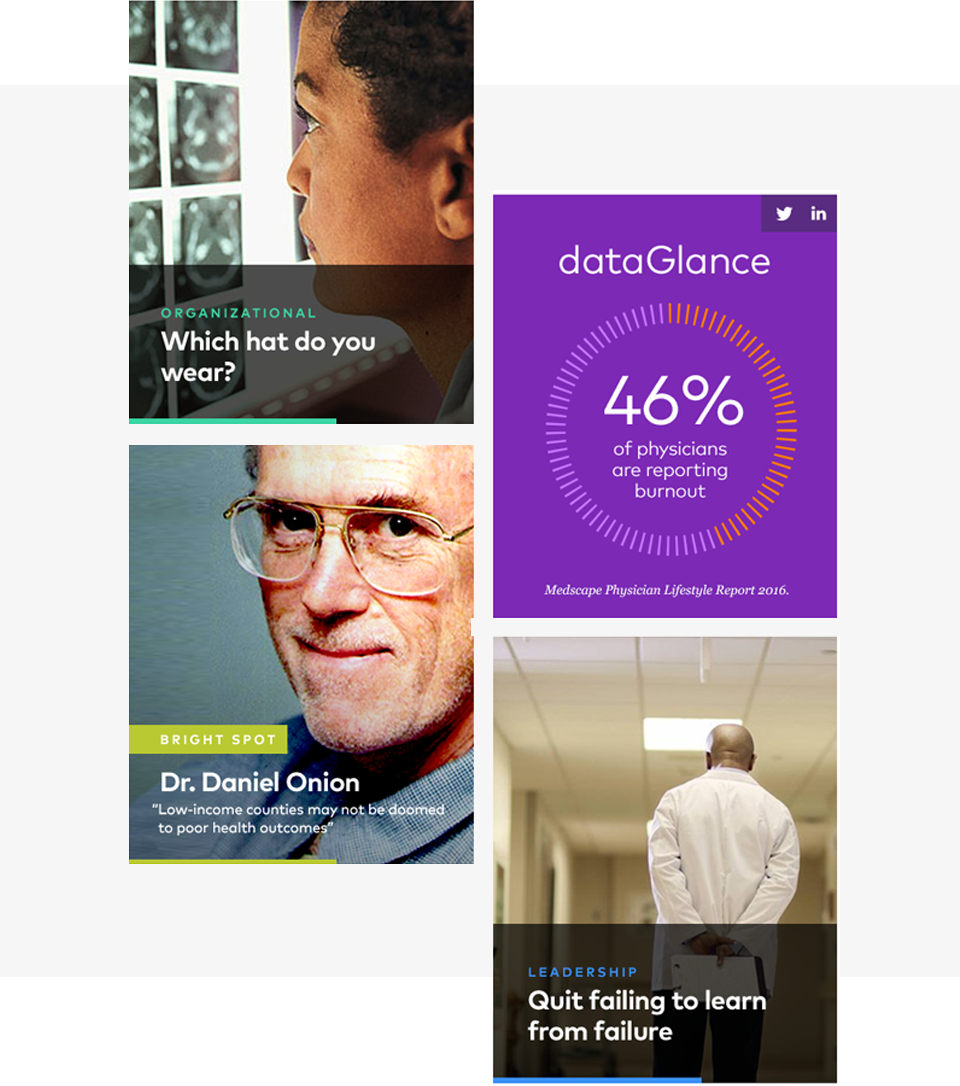
Power of the grid
A clean card-based grid and clear taxonomy brought order to the various content types on the home page, without compromising the visual interest.
Color pop
We juiced up their existing palette to make it feel more modern, while staying true to the brand. We paired that with clean typographic styles to ensure maximum accessibility, and unexpected micro animations brought a little surprise and delight.
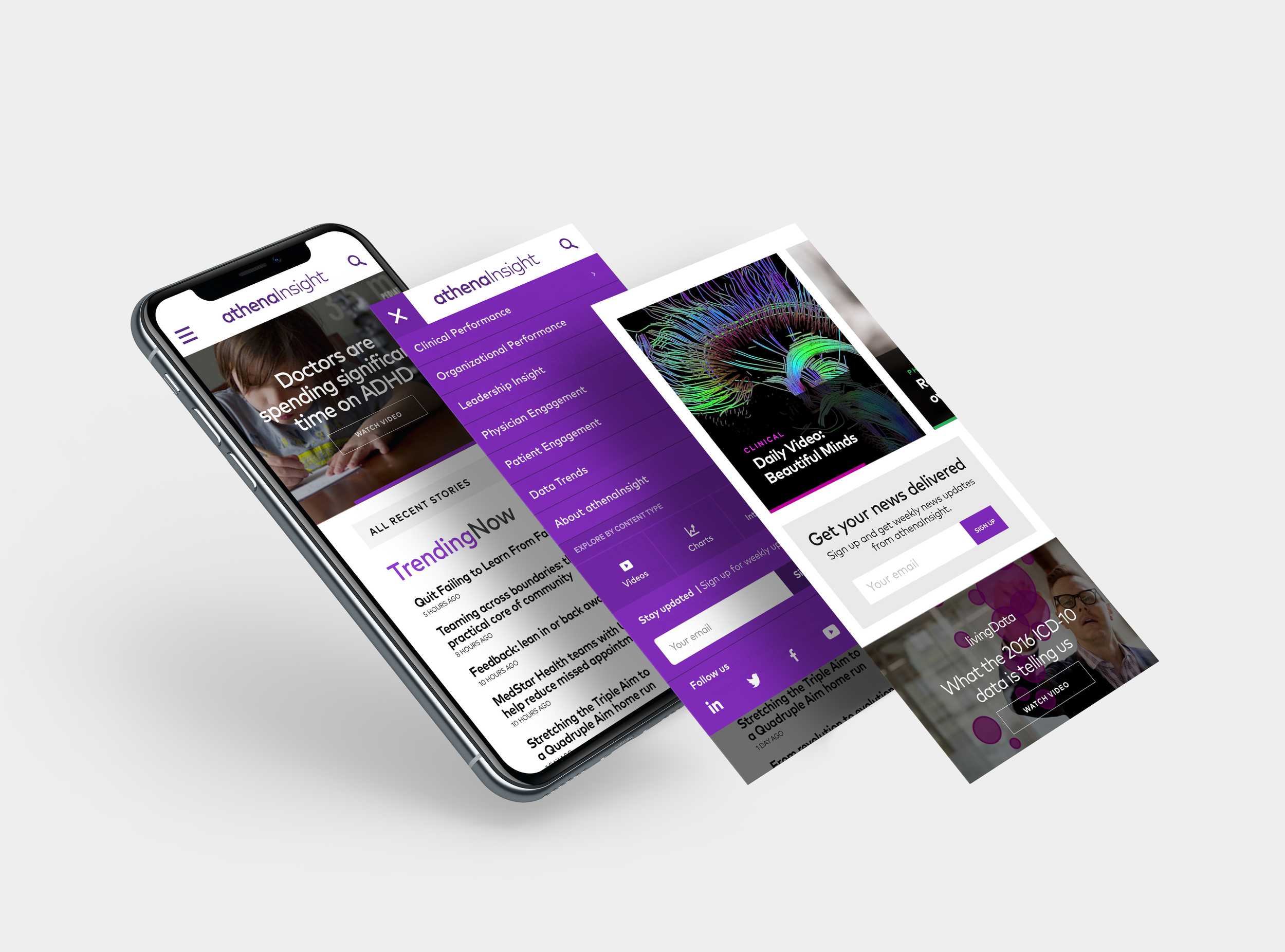
Mobile always
Our audience of busy doctors were most likely to be consuming the content on the go, so optimizing for mobile was a number one priority.
The resulting design was a really nice collaboration between UX and design, striking a balance between visual interest and clear wayfinding. Love it when that happens.


