Mintz Levin
rebrand + WEBSITE
Mintz Levin is a well-respected law firm that has stood the test of time - 80 years and still going strong. They have a hard-won reputation for helping clients break through into some of the world’s most innovative industries. They needed a logo and website that would help them stand out in an otherwise stodgy and conservative space. Shortening their name to just “Mintz” was a good start.
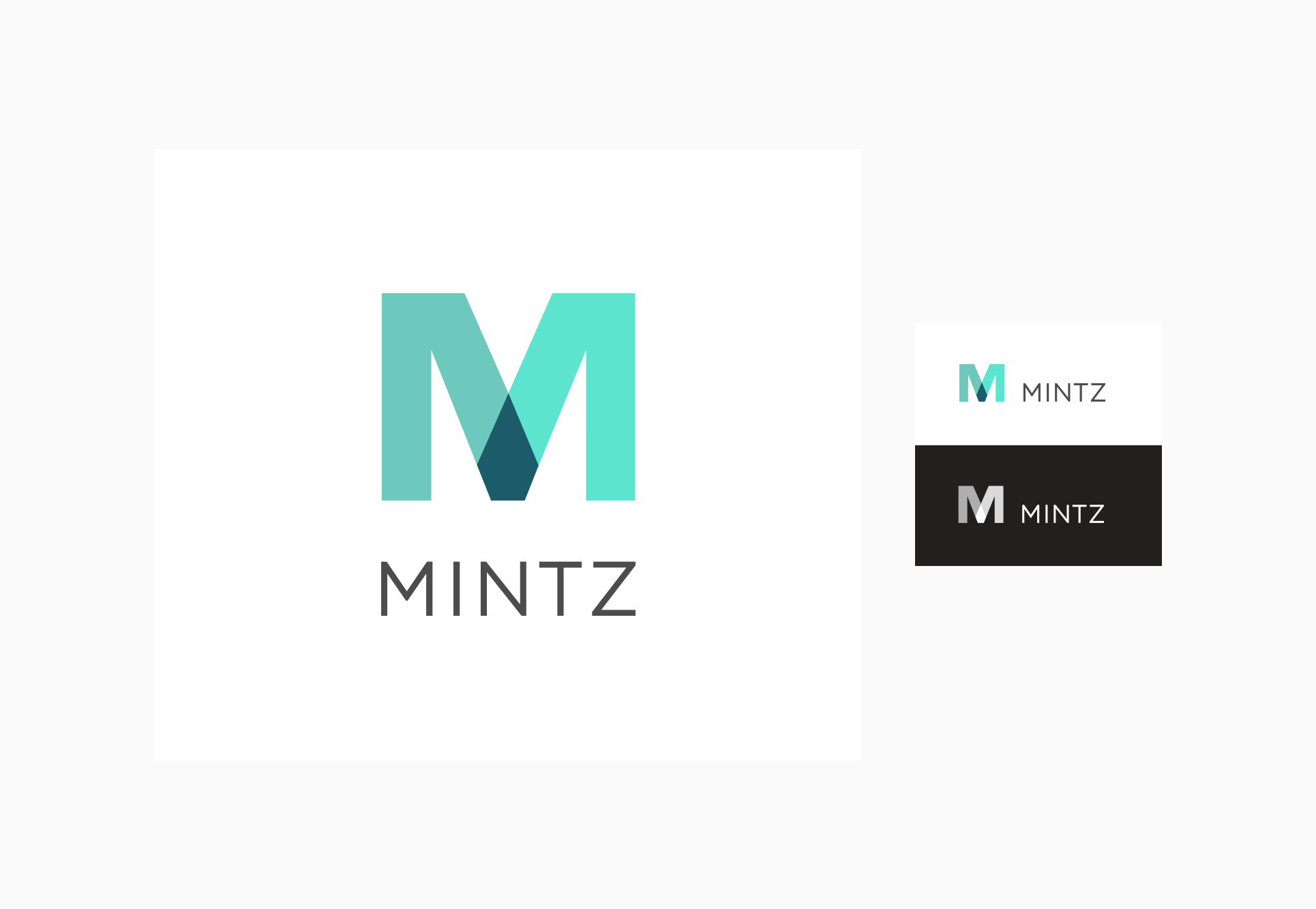
The logo design was inspired by the idea of intersection or overlap. History with innovation, Mintz with their clients. This theme of overlap then influenced the website design, where moving color fields interplay with one another as the pages load.
Mintz had lots and lots of dense content, so an exceptionally clean design was essential to give the material room to breathe and limit page dropoffs. Even the hardest working components were turned into an opportunity to extend our design aesthetic and reduce friction for the user.
A limited but powerful new color palette and clean typographic styles helped unify varied content types across the site. The overall transformation breathed new life into the Mintz brand and made them a stand out in an otherwise expectedly stodgy category.


